
Concept and Overview
Inside AFL is a streamlined approach to the latest AFL news, scores and statistics, designed for ambitious AFL Fantasy users. AFL Fantasy is an online competition in which users assemble a team under a specified salary cap, and this team scores points based on the actual performance of individual players. Success in AFL Fantasy is largely dependent on tracking player injuries, debutants and various statistics on a weekly basis. My ambition for Inside AFL was to essentially create a system of analysing relevant Fantasy stats and presenting them using more efficient, simpler and visual methods. With this in mind, the target audience for Inside AFL is AFL Fantasy users that are unable to dedicate extensive time to managing their team due to other time-restraining commitments. This predominantly includes users that are over eighteen, who are generally in the workforce or studying full-time at university.
Visual Communication & Design
Visual communication is a fundamental aspect of Inside AFL, specifically in regard to the Inside AFL Rating system that I have developed. This system involved choosing a select number of relevant players each round and creating a ‘Player Profile’ of sorts, using a consistent design that incorporates all of the important details. I elected to focus on visual communication as a clear direction for design is paramount in drawing a more engaged audience (Tan & Wei 2006).
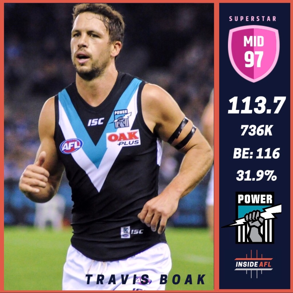
Figure 1 is an example of a design that demonstrates the basis of Inside AFL. It features the logo which I created with a simple design in mind, that relates to the subject (AFL) and is eye-catching. I then took the colours used in the logo and made them the ubiquitous colour scheme for all of my designs and most of the website. Figure 1 showcases the Inside AFL Rating in the top right, for which I decided to use more vibrant, noticeable colours, particularly as the ratings increased (i.e. lower rating bronze, higher rating pink). I ensured that the text was always an appropriate colour (that was a part of the colour scheme) so that it was always readable. The most crucial statistic, the player’s average score, is larger in size to demonstrate its importance.
These ‘Player Profiles’ were designed to catch the eye of the audience, and also provide the important Fantasy-relevant statistics of each player. These statistics (in the order shown in Figure 1) were the average Fantasy score, current price, breakeven, and ownership percentage. I explain the importance of these statistics in an earlier post on the site. I took all of these statistics into consideration to produce an Inside AFL Rating for each player. By viewing each profile, you will see how each rating is appropriate for each player. However, as I have mentioned on my site, these ratings are completely subjective and must not be considered to be representative of a player’s actual skill.
User Interface Design
From the outset, the purpose of my WordPress site was to collate all of the content from my other platforms (Twitter and Instagram) into one place, with additional text content. This allowed users the choice to either simply use the ‘streamlined’ content of Twitter (on-the-fly updates) or Instagram (visual content, infographics), or access the website for more in-depth content alongside it, such as full written reviews of each round. This stems back to my ambition for Inside AFL and its target audience, providing them with a simpler, more efficient way of viewing my content while also giving them the option to explore further if desired. Throughout the development of the user interface design, I regularly considered this as it is important to maintain an organised structure and ‘hierarchy’ of content (Johnson 2014).
I organised my content with the use of different categories as shown in the menu bar depicted in Figure 2. I maintained the notion that an effective user interface design for a site needs to be organised and divided into appropriate categories and sections (Djonov 2007). I essentially sorted my content into ‘Ratings’ (Player Profile designs featuring Inside AFL Ratings), ‘Reviews’ (Weekly round reviews alongside visual content and embedded Tweets), and ‘Team Discussion’ (A place where users can share and discuss their teams).
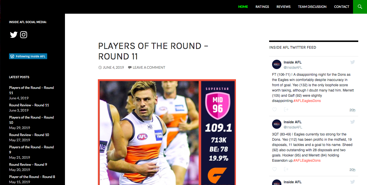
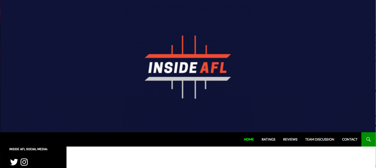
Figure 3 depicts my main homepage, which features the bulk of my content. I wanted a layout that adhered to my desire to categorise my content, and also allowed for widgets on both sidebars. It was important that I could add a live Twitter feed to my site, as this is where I posted the most frequent updates, and also my Instagram feed so that my designs could be showcased. On the left sidebar I also have an archive of the latest posts and links directly to all of my platforms. This allowed for the ‘interconnectedness’ that I desired between all of my platforms.
User Experience Design
User experience design was perhaps the most fundamental aspect of Inside AFL to consider, as it was important to recognise that visual elements are one of the most efficient ways to communicate with an audience (Marsh 2015). Twitter and Instagram were vital in the development of Inside AFL, as they allowed me to reach different audiences in a variety of ways. I maintained the same logo and identity throughout these platforms to enhance the cohesion that I desired to achieve, however I took advantages of the affordances of each platform.
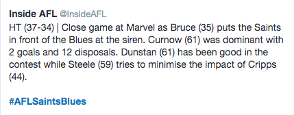
Twitter was used as a primary form of live communication with my audience. I used the platform to provide short, on-the-fly updates in accordance with Twitter’s 240-character post format. As depicted in Figure 4, this usually involved updating my audience on the current match score, as well as the Fantasy scores from all of the top-scoring players.
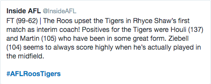
I tried to ensure that I posted an update at each break of every game I watched, which was at least 3-4 matches most weeks. I adhered to a consistent format for my Tweets which were short yet informative. As demonstrated in the example of Figure 5, I often started with an introductory sentence to summarise the match (and also the score), followed by a mention of each top-scorer from the match. I embedded key Tweets each week into my weekly Round Reviews, which were all under the ‘Reviews’ category on the website.
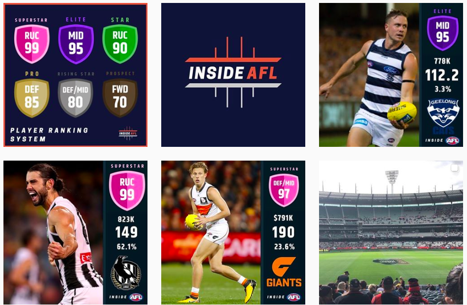
Conversely, I took advantage of Instagram as the primary form of visual communication. This is where I posted my designs and infographics as seen in Figure 6, including the Player Profiles, Trade Alerts (earlier in the season), and other miscellaneous photographs or designs such as photos taken live at matches and a breakdown of the Inside AFL Player Rating System. These were all collated on the ‘Ratings’ page of the website.
The website was used as a means to bring all of the content from Twitter and Instagram together with additional textual depth. I asked the class during presentation if they thought this overall model of communication was appropriate for my site, and they agreed.
Audience Metrics
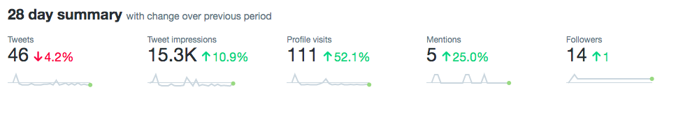
Twitter was my most successful platform for reaching my target audience, as the analytics in Figure 7 demonstrate. This leads me to believe that this is the platform I should use to build my audience in future.
I conducted several A/B tests throughout the semester, as it is important to experiment and monitor analytical data in order to determine the expected success of a product (Sanderson 2018). This hence allows me to identify appropriate strategies to employ while communicating with my audience.
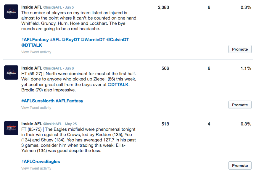
Figure 8 depicts my top three Tweets from the last 28 days. In the first (A), I tagged popular verified Twitter users with a similar target audience. The second Tweet (B) only uses hashtags. The hypothesis here was that if I can engage with high-traffic users with a similar audience, then the audience will also provide a relatively high amount of traffic to my Tweet. In this case the hypothesis was supported, as Tweet (A) was engaged (liked) by one of the tagged users and the number of impressions rose exponentially compared to Tweet (B).
There is also another example of my A/B testing that can be seen in Figure 8, between the second Tweet (A) and the third (B). Essentially in Tweet (A) I use more hashtags and in Tweet (B) I use less. The simple conclusion is that more hashtags will equate to more interactions, however it can also be seen that there is a slight increase in engagement rate.
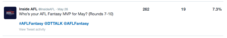
Figure 9 showcases the Tweet that had the highest engagement rate of the month. This Tweet in particular featured a poll. I ran several polls which received 30-40 votes on average, and these were largely successful due to my use of hashtags and tagging verified users. These audience metrics suggest that I can build my audience and their interactions through the use of hashtags and by getting involved with similar users.
Future Directions and Development
I thoroughly enjoyed the time that I have spent working on Inside AFL. It allowed me to connect with an audience in which I can consider myself to be a part of, and thus I found it easy to communicate and relate with them. I would like to continue developing Inside AFL, however it will depend on my other commitments and time restraints moving forward, similar to my target audience. My next objective would be to build a larger, more consistent follower base, that regularly interacts and engages with my content. The site needs improvement; I particularly wanted to create a dedicated forum for team discussions but payment was needed for the necessary plug-in. This would also help in building the audience of Inside AFL, however I had to settle for using a simple comment section for now. In future I may look further into the analytics and conducting testing to find a specific age range for my intended audience, as this would allow me to explore more strategies that I could use to engage this audience.
References
Djonov, E 2007, Website hierarchy and the interaction between content organization, webpage and navigation design: A systemic functional hypermedia discourse analysis perspective, Information Design Journal, vol.15, no.2, pp.144-162.
Johnson, J 2014, ‘Designing with the mind in mind: simple guide to understanding user interface design guidelines’, 2nd edn, Elsevier, Boston.
Marsh, J 2015, UX for Beginners: A Crash Course in 100 Short Lessons, vol.7, pp.111-127.
Sanderson, M 2018, ‘A/B testing: how offline businesses are learning from Google to improve profits’, The Conversation, 21 November, viewed 4 June 2019, <https://theconversation.com/a-b-testing-how-offline-businesses-are-learning-from-google-to-improve-profits-106843>
Tan, H. G & Wei, K. K 2006, An empirical study of Web browsing behaviour: Towards an effective Website design’, in Wed-enabled Business and Customer Value, vol.5, no.4, p.261.
